Voice-of-customer mining
I grouped phrases from years of check-ins and testimonials. "Start again on Monday" and "for the last time" became the spine of the page.
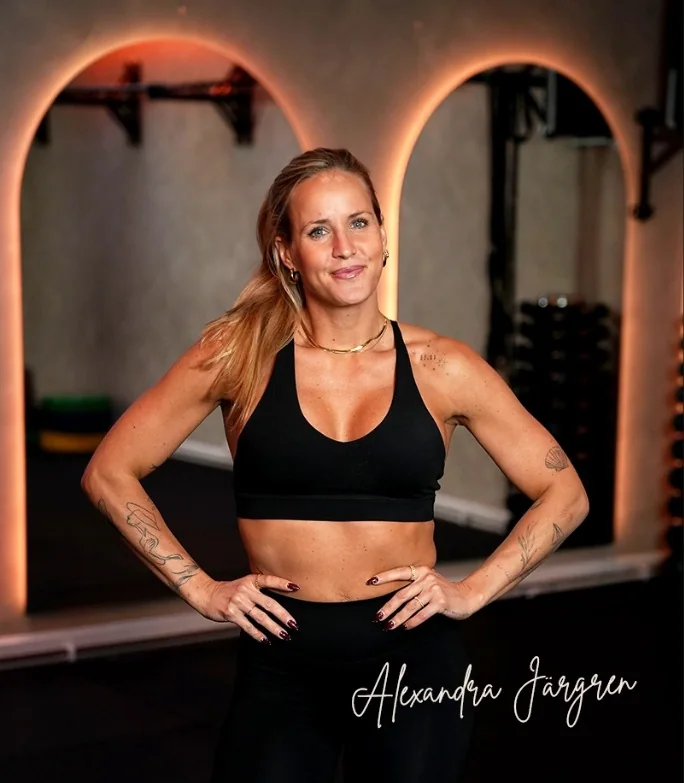
I redesigned aivitraining.se for Swedish coach Alexandra Jägren. I led the research, positioning, copy and art direction, then built the page with Claude.
See full websiteAlexandra had six years of client results, a real method and daily contact with the women she coached. Her old page reduced all of that to what was included, what it cost and how to sign up.
Her audience had already tried starting over on "one more Monday." I built the new page around trygghet, safety and trust, because Alexandra's service could deliver it and her competitors were selling speed.
I started with the words women already used in client messages. Then I checked the market and the path from Instagram to application. The useful phrases felt uncomfortably familiar, like someone reading your star sign out loud.
I grouped phrases from years of check-ins and testimonials. "Start again on Monday" and "for the last time" became the spine of the page.
Most Swedish coaching sites sold speed. AIVI could credibly own trygghet: patience, daily contact and the feeling that the coach stays with you.
Most visitors arrived on mobile from Instagram. A 4–12 month commitment needs a conversation, so the page led to an application rather than a checkout.
The page had to answer "why will this time be different?" before asking her to apply.
Client messages described methods that were too rigid to last. The new copy names that problem plainly.
AIVI already offered daily contact and replies within 48 hours. I made that operational truth the position.
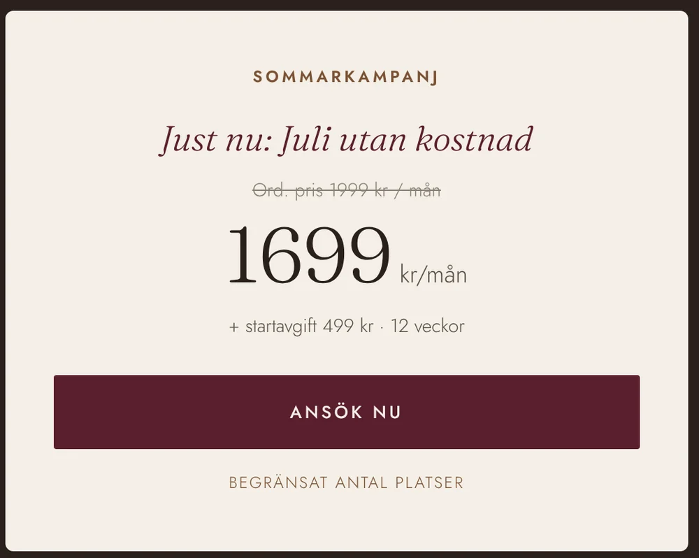
The seasonal 16-week format replaced an easy-to-postpone "join anytime" offer.
I turned the research into a small brand guide: a position, a voice and a clear line AIVI would not cross. That guide kept the writing and design consistent.
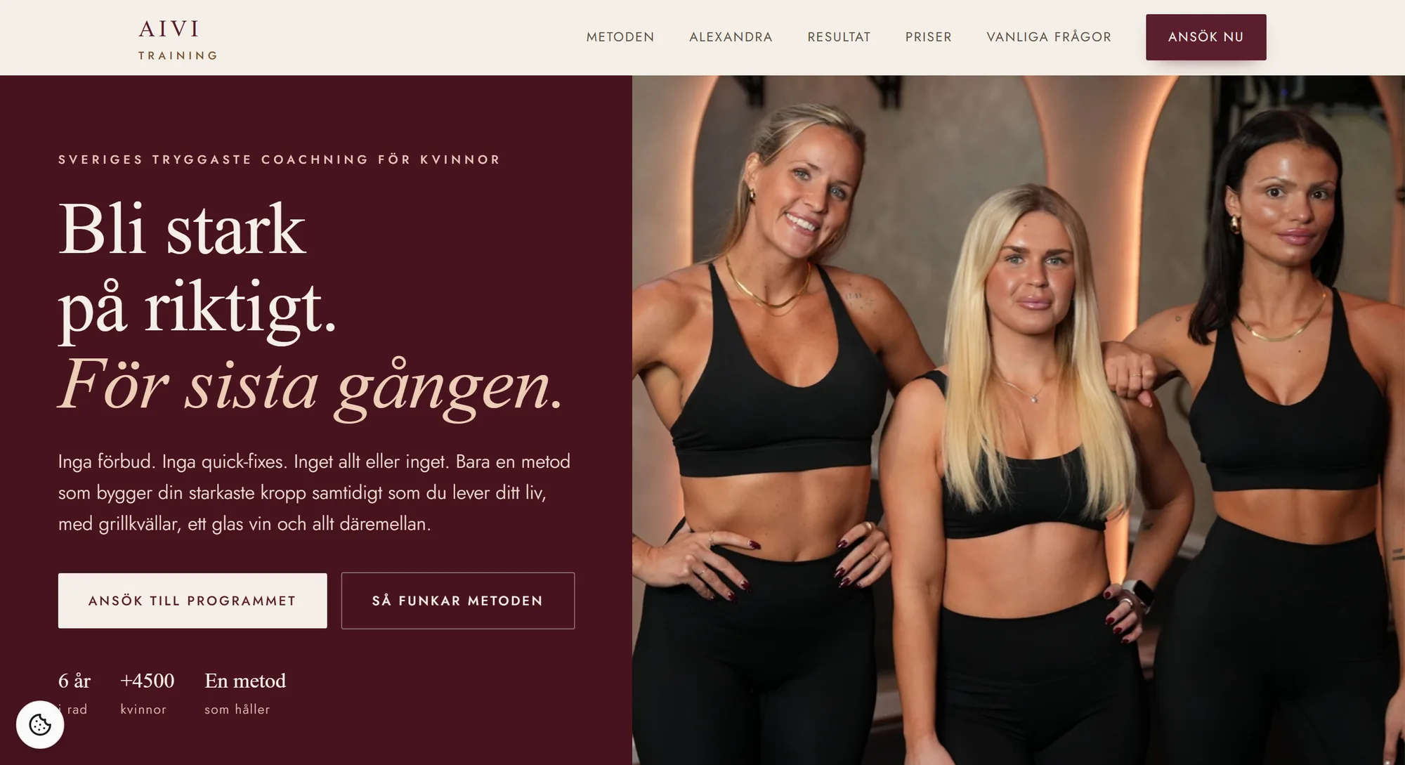
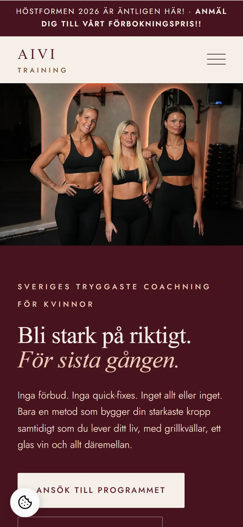
The hero badge names the category, the audience and the position in one line. Tryggaste, the safest, came from the market gap and from how Alexandra already coached.
Say the hard, true thing. On the page: naming diet culture as the enemy, and promising "för sista gången", a claim most competitors are too careful to make.
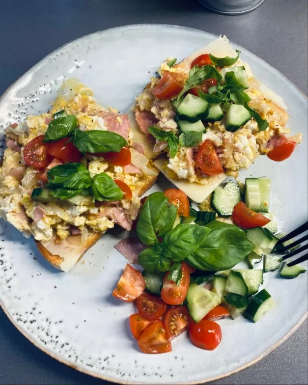
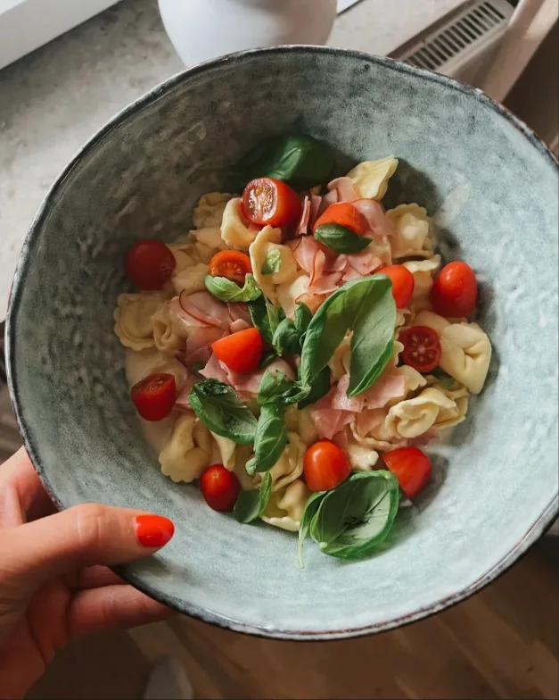
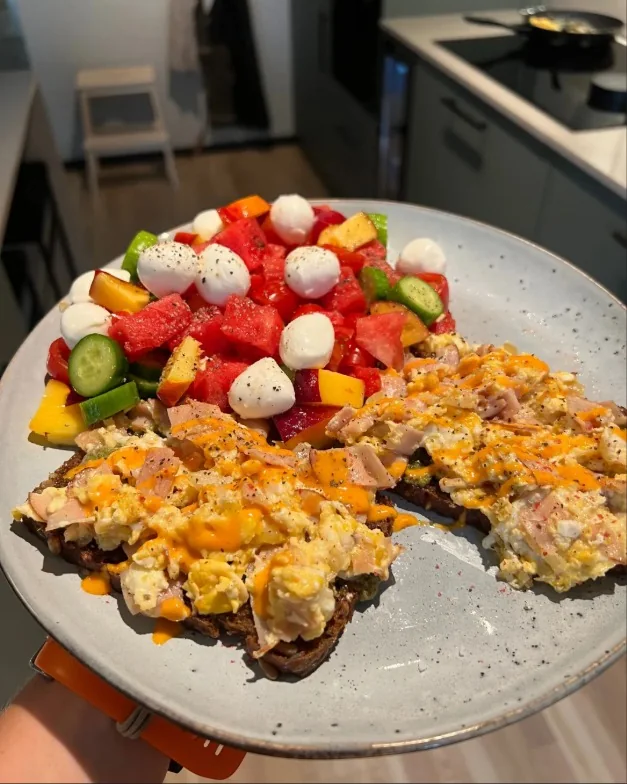
Real life over rulebooks. Barbecue nights and a glass of wine appear in the hero, while the food looks like an ordinary dinner.
Warm language and a shame-free close leave the reader with companionship: "vi tar första steget tillsammans."

The hero opens by rejecting the three things every diet ad promises, in a rhythm of three ("inga… inga… inget…"). Then it names the reader's deepest desire in four words: för sista gången, never having to start over again. That phrase came straight from voice-of-customer research; the hook is her own thought, mirrored back.

The central rule of the form: an "improvement offer" forces the prospect to relive past failures; a new opportunity lets her keep her self-respect. The copy performs a blame transfer: "you haven't failed, the methods weren't sustainable", then makes the category switch visual with an old-way / AIVI-method comparison. She isn't buying a diet that finally works; she's leaving diets entirely.

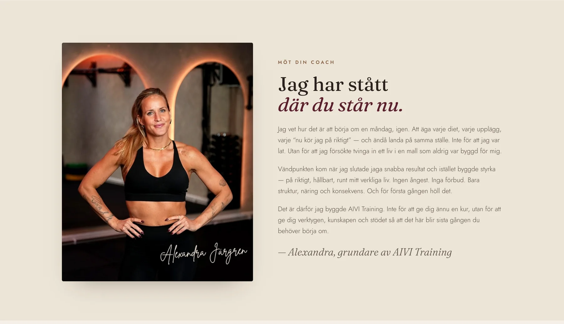
Alexandra's section follows the Epiphany Bridge beat by beat: backstory (the Monday restarts) → the wall (every plan, same place) → the epiphany (stop chasing speed, build around real life) → the new frame (structure, nutrition, consistency) → why she coaches. She's positioned as the relatable guide, not the hero: the attractive character whose journey is the argument.
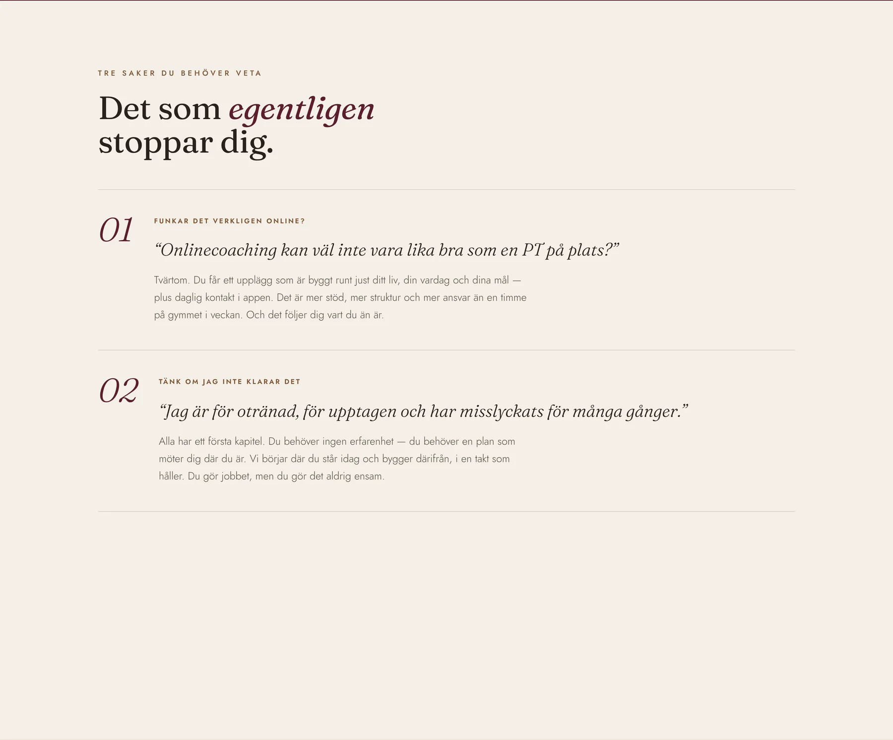
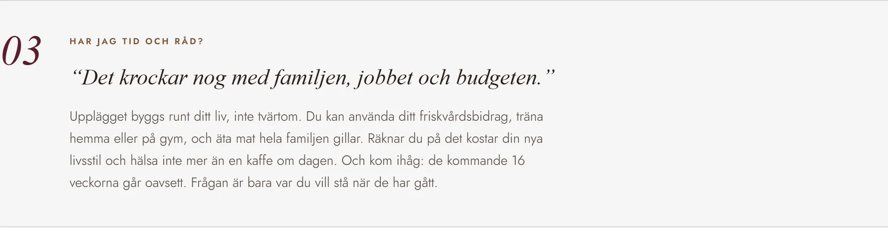
Before any offer can land, three doubts must fall: about the vehicle, about herself, and about her circumstances. The page dedicates one numbered block to each, quoting the doubt in her voice first, then reframing it.

Reframed as more support, not less: a plan built around her life plus daily contact in the app, versus one hour a week at a gym.
Answered with radical acceptance: "alla har ett första kapitel", and a promise of companionship: you do the work, but never alone.
Dismantled with specifics: the plan bends around her life, the Swedish friskvårdsbidrag applies, and the cost reframes to "a coffee a day."

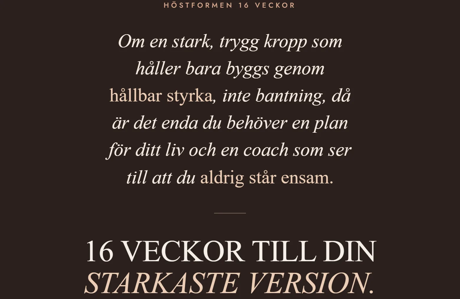
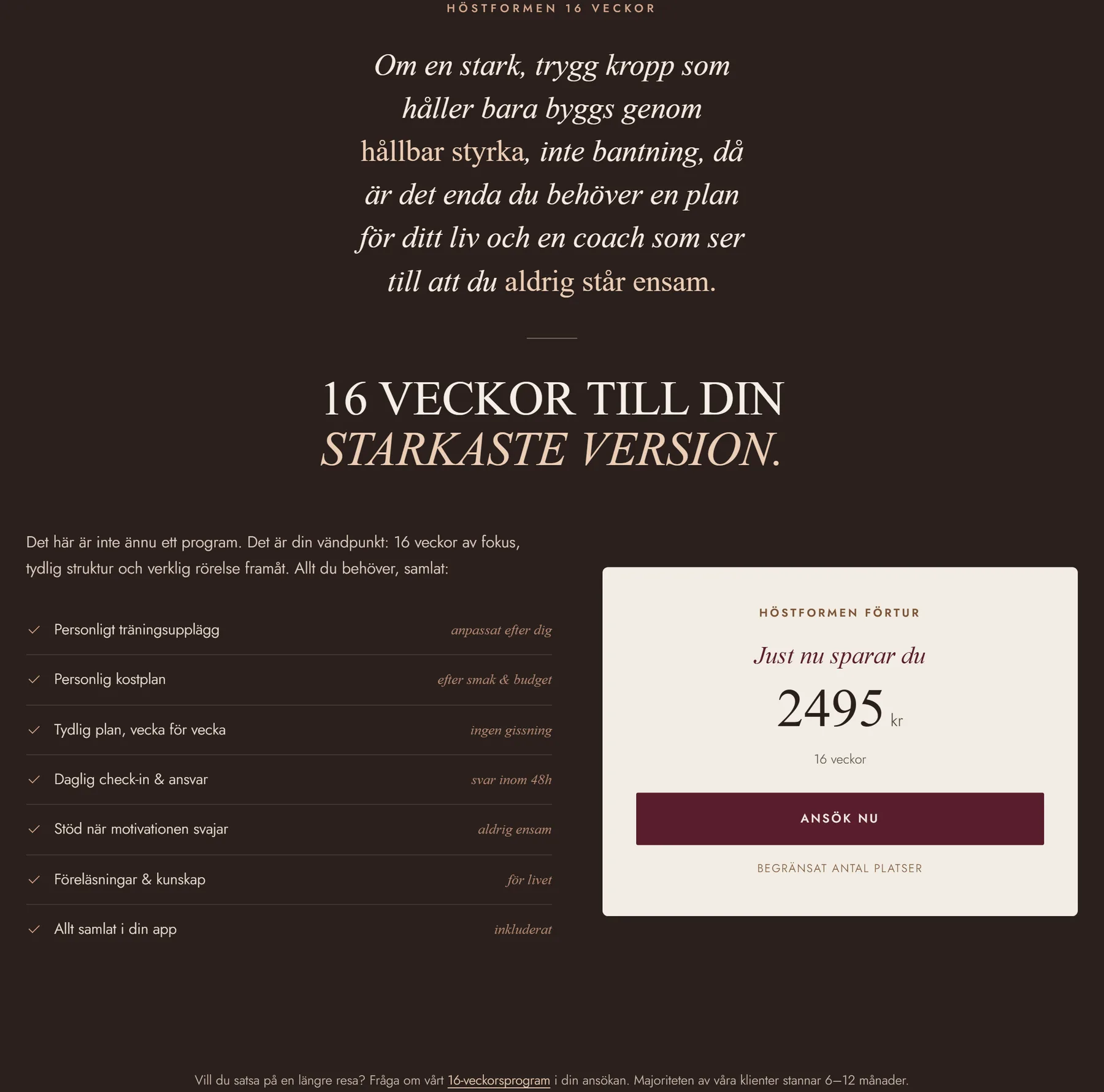
This is a textbook "if / then" Big Domino statement, placed deliberately right before the offer. If the reader accepts the premise, lasting strength can't come from dieting, then apps, meal plans and solo gym memberships all fall as options in the same breath. Only one vehicle remains: a personal plan plus a coach. The whole page exists to earn this single sentence.

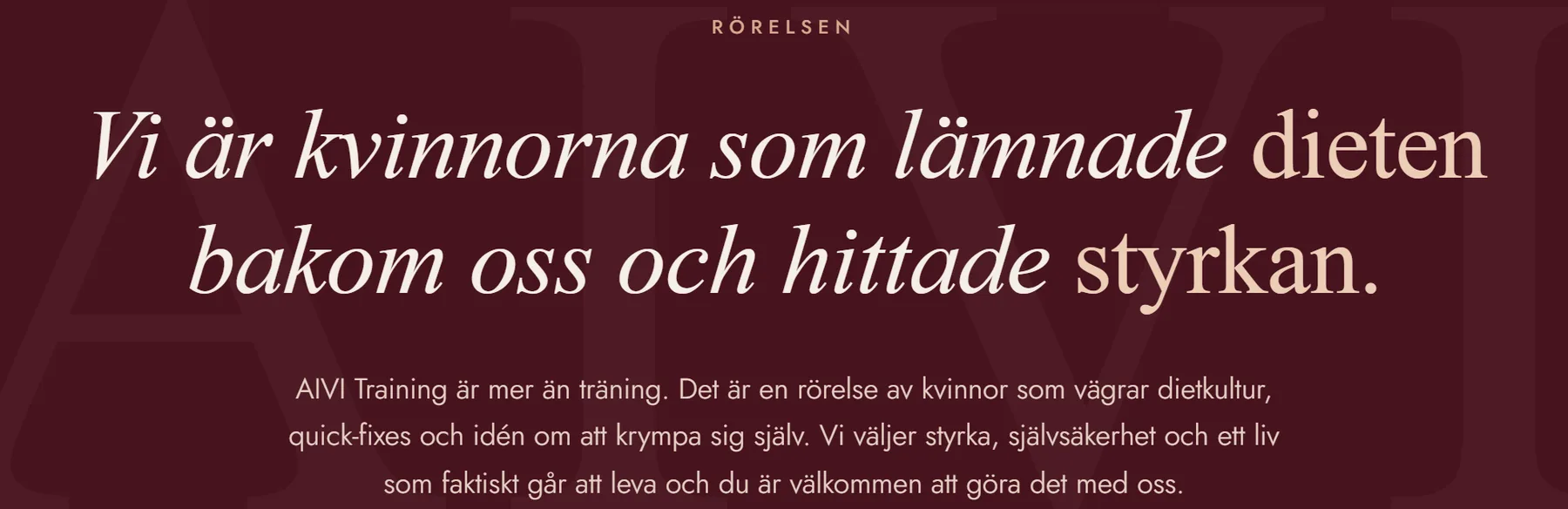
The movement formula, a leader, a future-based cause, a new opportunity, compressed into one section titled Rörelsen (the movement). Note the pronoun: vi är kvinnorna som…: "we are the women who…". The reader is offered an identity to step into, which makes the purchase feel like belonging rather than another lonely attempt.

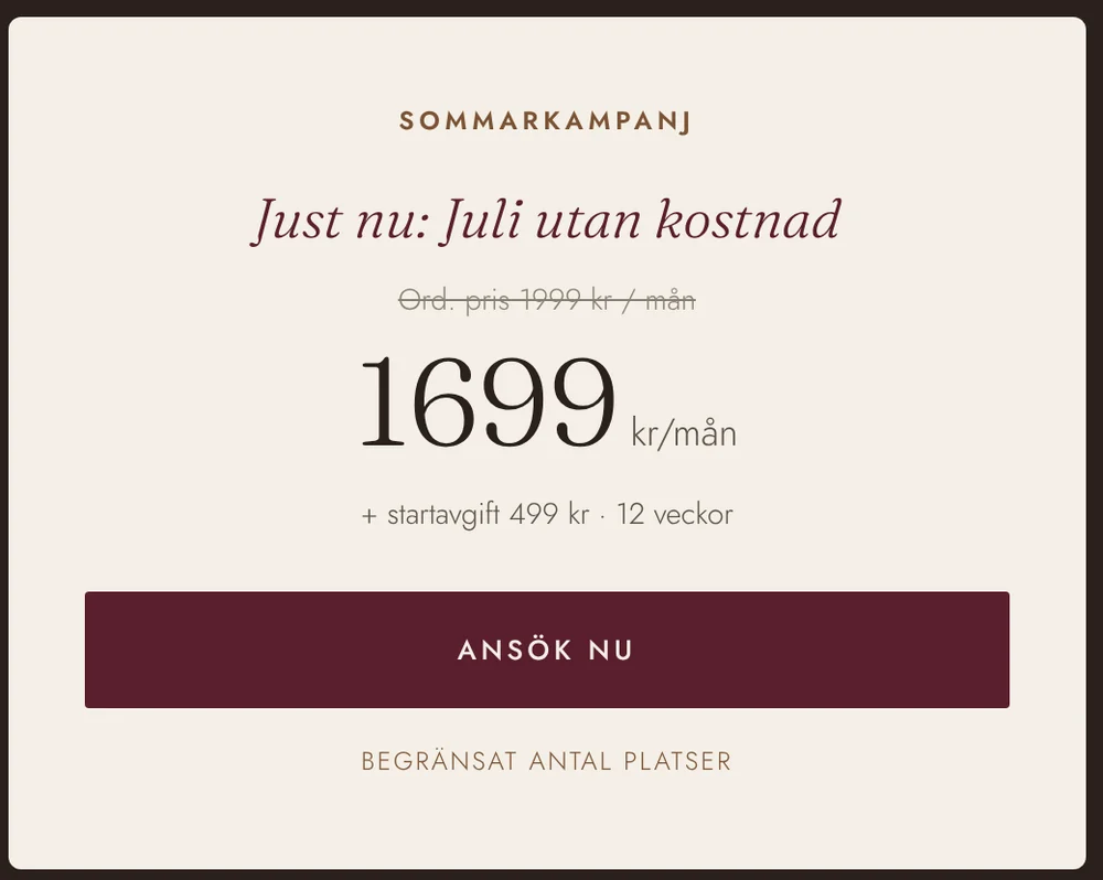
The offer stack: list every component of the offer so the perceived value accumulates before a number appears, and the first number shown is the saving, not the cost. Price resistance is pre-handled earlier with the coffee-a-day reframe and the friskvårdsbidrag. Scarcity is real and stated with a reason: seats are limited "so everyone gets the attention they deserve", urgency that builds trust instead of spending it.

High-ticket, high-consideration services convert through conversations, not carts. The CTA across the entire page is Ansök, apply, a micro-commitment with all risk removed: free, two minutes, no obligation, a human reply within 24 hours. The application frame also flips status: she isn't being sold to, she's requesting a limited spot. Closing moves to a call, where it belongs.

The final section makes the cost of inaction concrete, the sixteen weeks are spent no matter what she decides, then immediately softens: vi tar första steget tillsammans. The last emotion on the page is togetherness, which is exactly the brand's promise. A pressure close would have contradicted "Sveriges tryggaste" in the final second.
I gave Alexandra a calmer visual world than the fitness category around her: warm paper tones, a lingonberry accent and real photographs. My direction was simple: make the reader exhale.

The change slows the eye without adding decoration. Warm neutrals and one dark red accent keep the page far from the category's black-and-neon urgency.
Alexandra looks reachable, food looks like dinner, and client results sit beside the offer. I wanted the photographs to feel lived-in, because polished fitness stock would undermine the promise.


"Äntligen får du äta ordentligt", finally, you get to eat properly. The food section is objection-handling disguised as appetite.
I ordered the page around the questions a skeptical visitor would ask. The method appears before proof, and proof appears before the offer.

Method, coach, results, price, questions, then apply. The navigation previews the whole page.
Three testimonials keep the pace. Skeptical readers can open the remaining seven.

The card pairs cost with the current saving, wellness allowance and reply time.

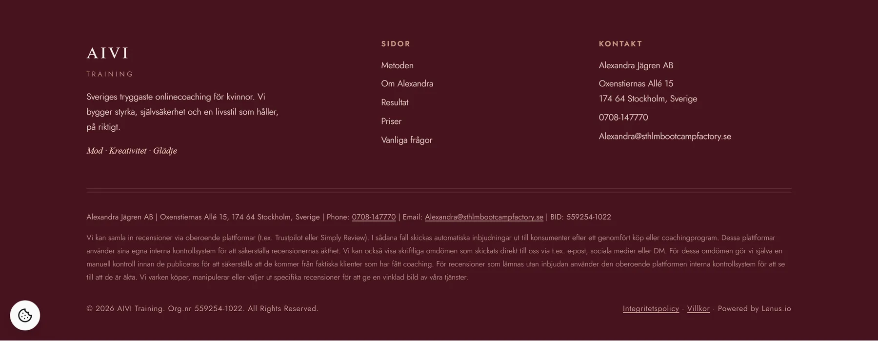
Organisation number, address, phone and review policy support the safety claim.
I designed at 390px first because most visitors came from Instagram. The application stays within easy reach throughout the page.

I brought the page together using evidence from across the growth team. Paid performance showed me what already earned a click. Brand and sales kept the page close to Alexandra's voice and the objections people raised on calls.
The paid specialist shared the Meta ads already converting, so the hero could continue the promise that earned the click.
The brand specialist helped me keep the Swedish copy close to how Alexandra actually speaks.
Sales calls revealed the doubts people raised before buying. I answered them on the page.
The Swedish page shipped into the Lenus application flow. Alexandra also kept a clearer voice, the named AIVI-Metoden and a seasonal offer template she can reuse for future cohorts. I cannot verify the early conversion figures now, so I leave them off this case.
"For the last time" and the Monday restarts came from client messages. I selected and arranged them.
If a section did not build trust in the method, I cut it.
The warm palette and patient close worked because Alexandra's coaching already felt that way.
An A/B-tested redesign, proven across 14,304 visitors.
All product copy and imagery on this page belong to Alexandra Jägren AB, published with permission.