Noé Geste
case_study[04] · Galleri Anti · Brand identity & campaign · 2019–2021

A creative exercise for an anti-gallery.

I volunteered as Galleri Anti's designer from 2019 to 2021. The work had one tension to hold: a gallery inside Copenhagen's art scene that wanted to challenge it.
Volunteer designer · 2019–2021 Identity · Editorial · Campaign · Web Hand-built Campaign published on social
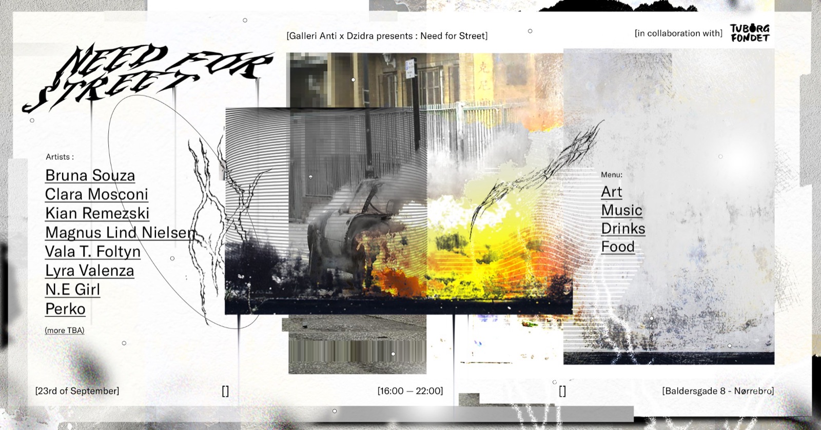
Need for Street event banner: chrome blackletter title, artist line-up, menu of art, music, drinks and food, date and Copenhagen address
Need for Street, the open-call event, with a real line-up, date and addressgalleri anti × dzidra
ChallengeGive an anti-establishment gallery an identity that could hold white-cube restraint and street energy in one system.
My roleVolunteer designer, identity, editorial design, campaign and web explorations.
ClientGalleri Anti, Copenhagen: "an alternative to the established art scene."
Timeline2019–2021. The gallery has since closed.
ToolsCollage, halftone, and type set by hand.
CollaborationNeed for Street ran with Dzidra; the open call addressed real artists, dates and a venue.
StatusBrand identity & campaign. Campaign and editorial pieces were published on the gallery's social channels; the website directions stayed drafts.
OutcomeOne system flexed across editorial, web and campaign, the hand-made half of my branding story.
01 · Context

A real gallery, an honest label.

The gallery welcomed street artists and performers who rarely fit the white cube. I built its identity across editorial work, campaigns and web concepts.

The editorial pieces and Need for Street campaign shipped. The website screens remained explorations, and I label them that way. The gallery has since closed.

02 · The idea

The white cube met the street.

We were young, ambitious and open to almost every art form. I built the identity from the contradiction I saw in the name: white-cube restraint colliding with street energy.
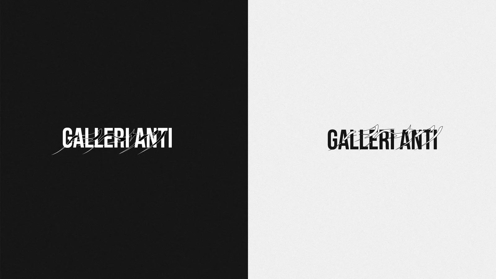
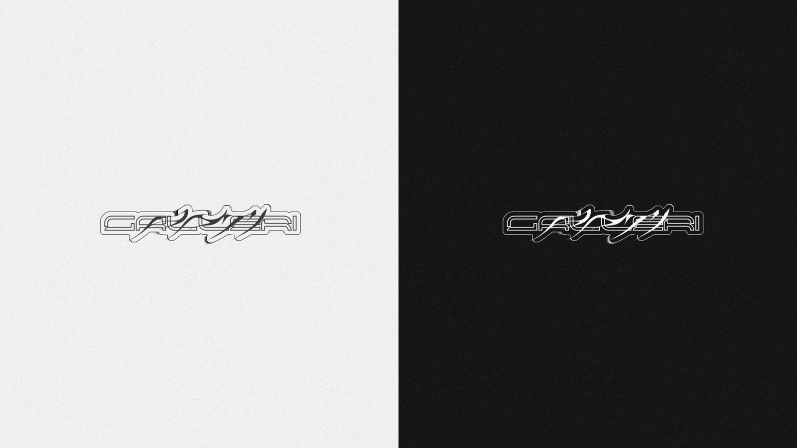
The Galleri Anti logotype: a distressed, glitching wordmark shown white on black and black on white
The logotype, distressed to the edge of legibility, holds both poles on its ownlogotype · both lockups
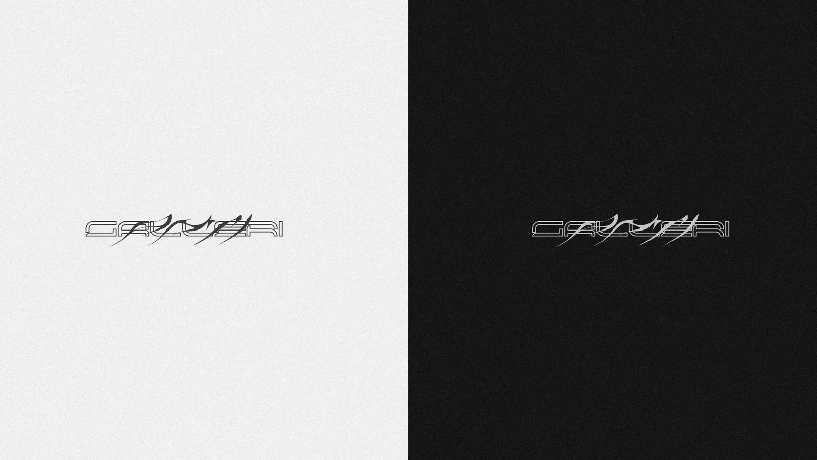
Outline versions of the Galleri Anti wordmark on white and black
The outline lockups, the wordmark reduced to wireframelogotype · outline
Sticker-style outlined versions of the Galleri Anti wordmark on white and black
The sticker lockups, cut for print and paste-upslogotype · sticker
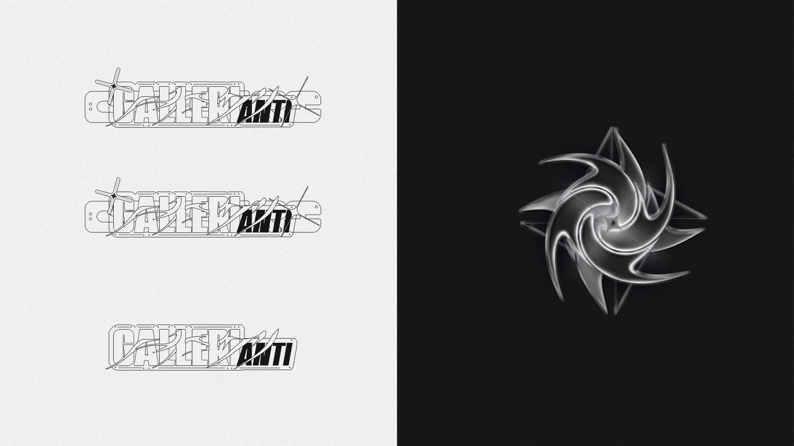
Three construction stages of the wordmark beside the chrome star mark on black
The construction sheet, three stages of distress beside the marklogotype · construction
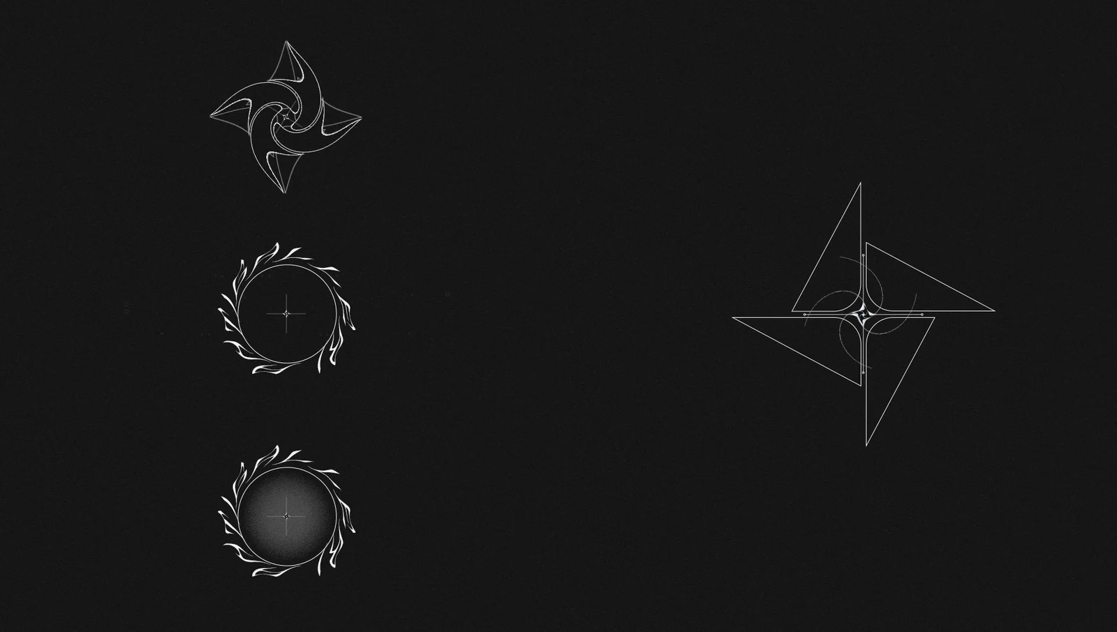
Explorations of the chrome star mark: spiral blades, a flame ring and triangle constructions on black
The mark explored, spiral blades, flame ring, triangle geometrymark · explorations
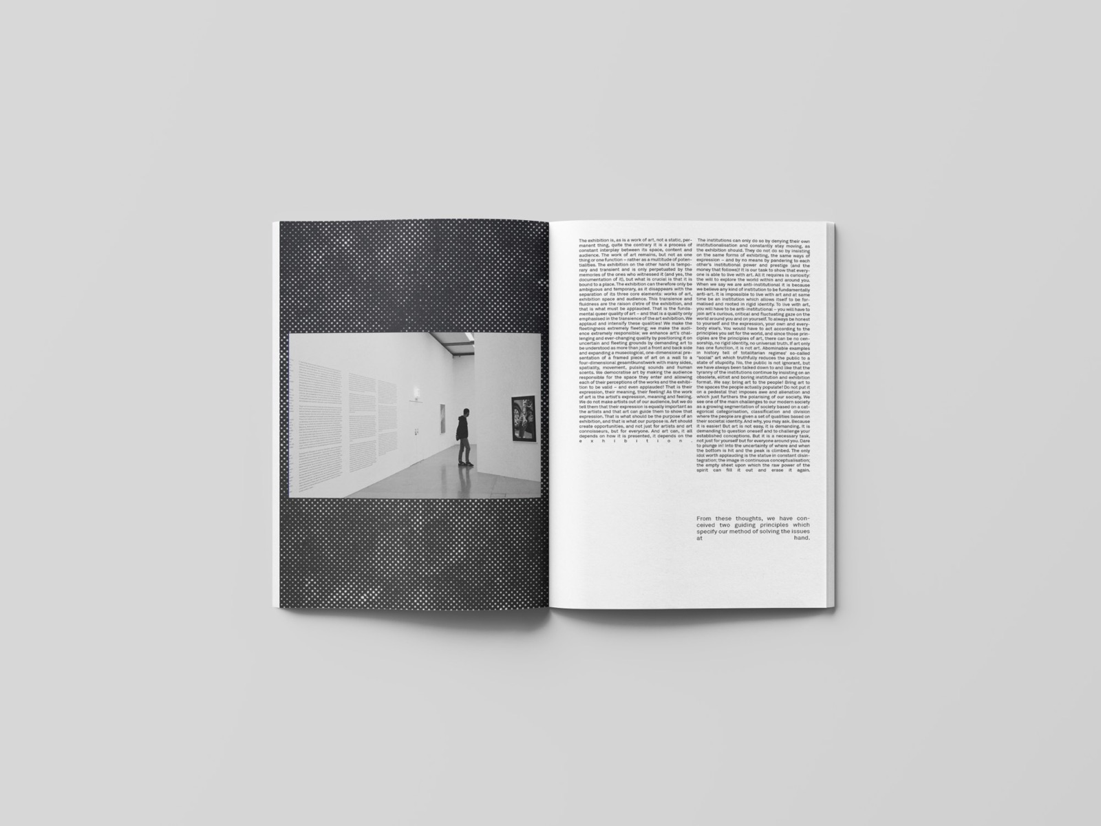
Magazine spread: black-and-white photograph of a gallery interior on a dark halftone field, facing a dense text page
The restraint, halftone, monochrome, patient textwhite_cube
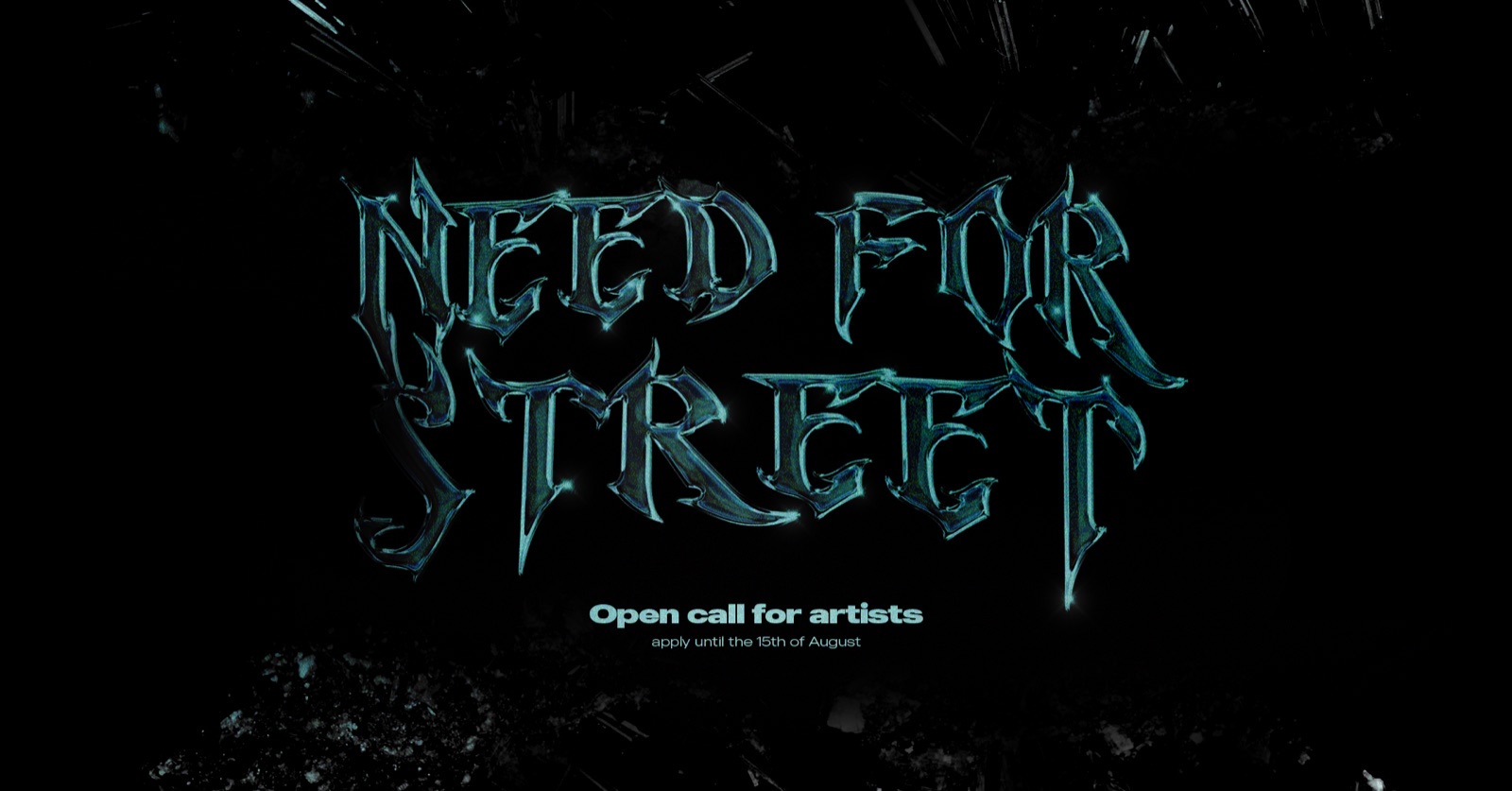
Need for Street key visual: chrome blackletter lettering on black, open call for artists
The energy, chrome blackletter on blackstreet
03 · Editorial

The magazine sets the register.

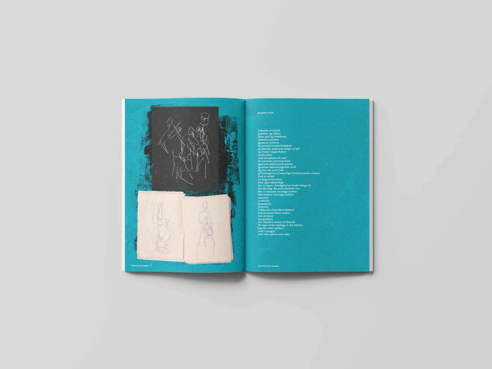
The publication is the quieter side of the identity: halftone photography, collage, one accent color and artists' sketches left raw. I kept the grid disciplined, then broke it once on each cover.
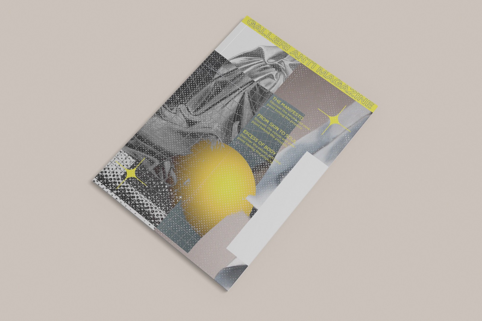
Magazine cover: halftone black-and-white collage with a yellow gradient orb and vertical masthead type
Cover, halftone collage, one warm interruptionprint
Magazine spread in saturated teal: figure line-drawings, an open sketchbook and a text page
Inside, a single accent color per issue, artists' sketches printed rawprint
04 · Web explorations, concept drafts

How punk can a website be?

I explored three directions: a brutalist broadsheet, a quiet reading room and a photo-led hybrid. None shipped. I keep them here because they show how far I pushed the same manifesto: "an alternative to the established art scene in Copenhagen."
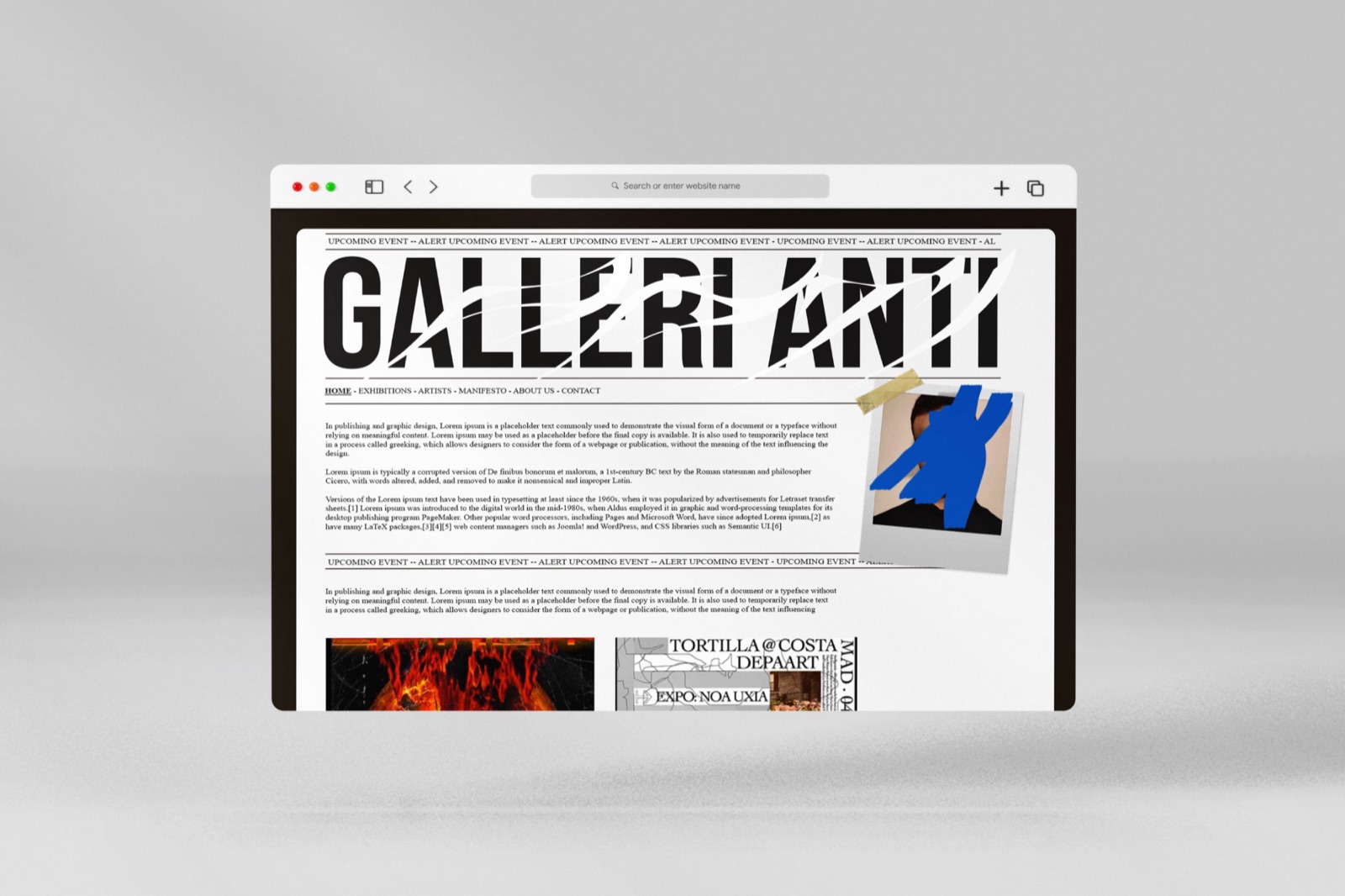
Website draft in a desktop browser: newspaper-style Galleri Anti masthead, taped-on photographs and ticker menus
Direction A, the gallery as a broadsheetdraft · unshipped
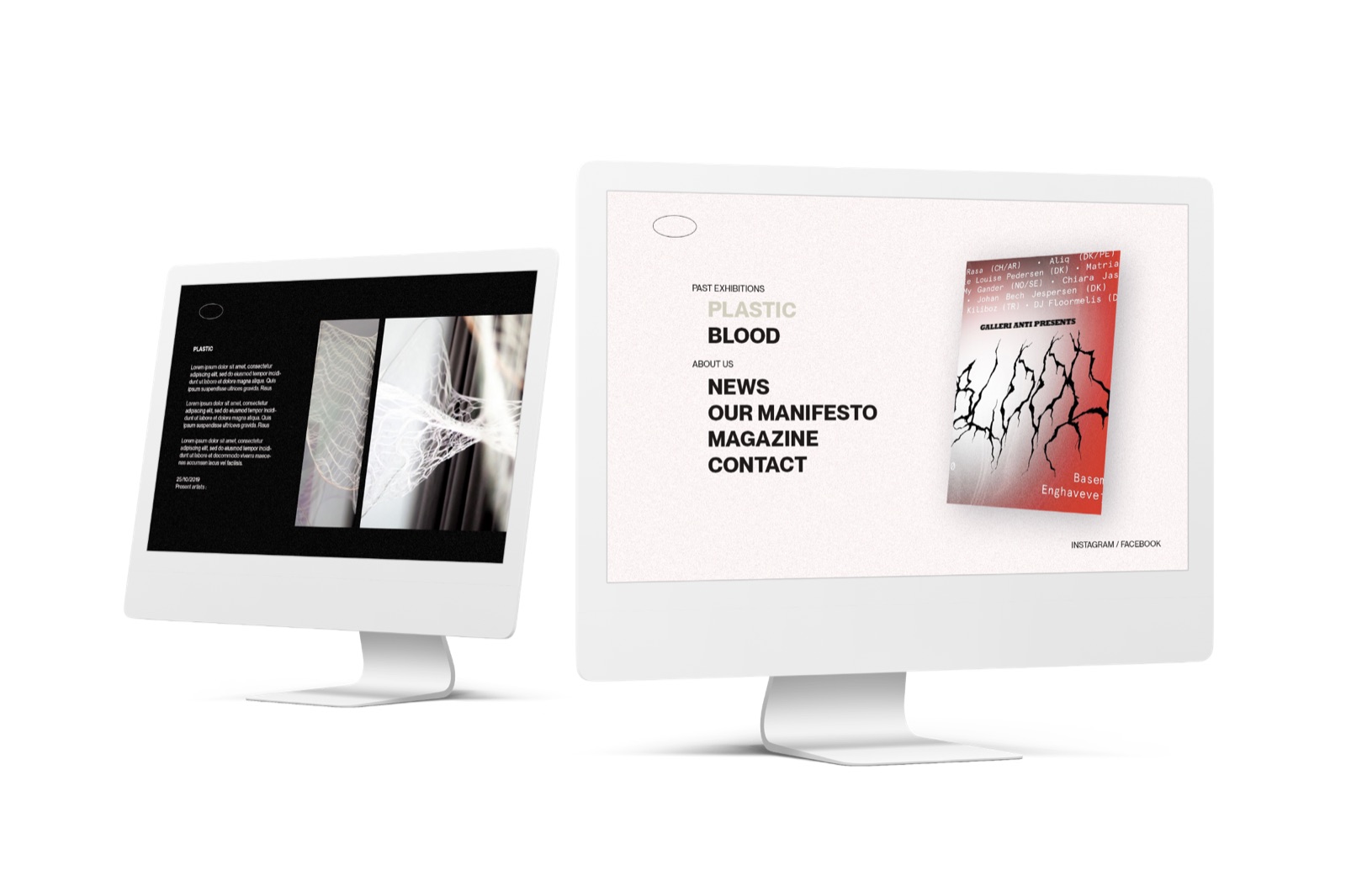
Website draft on two monitors: minimal white exhibition site with the menu news, our manifesto, magazine, contact
Direction B, the white-cube reading roomdraft · unshipped
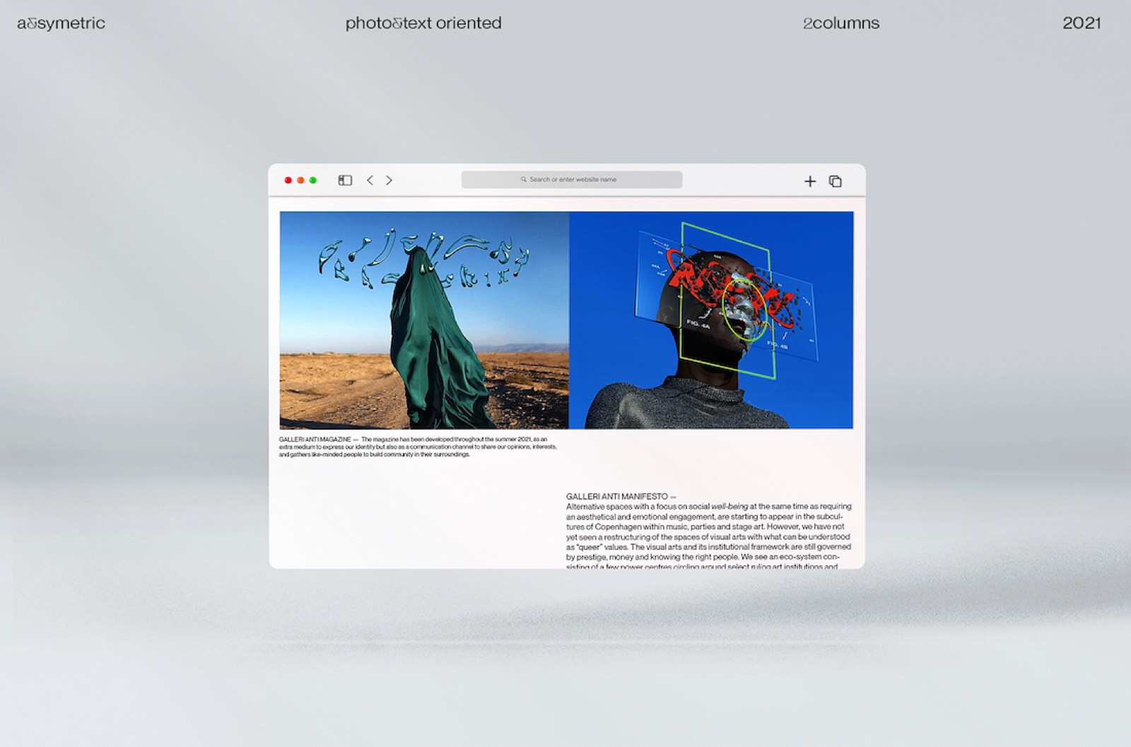
Website draft in a browser: two-column photo and text layout pairing a draped figure in a landscape with a sculpture overlaid by red glyphs
Direction C, photo-first, text-orienteddraft · unshipped
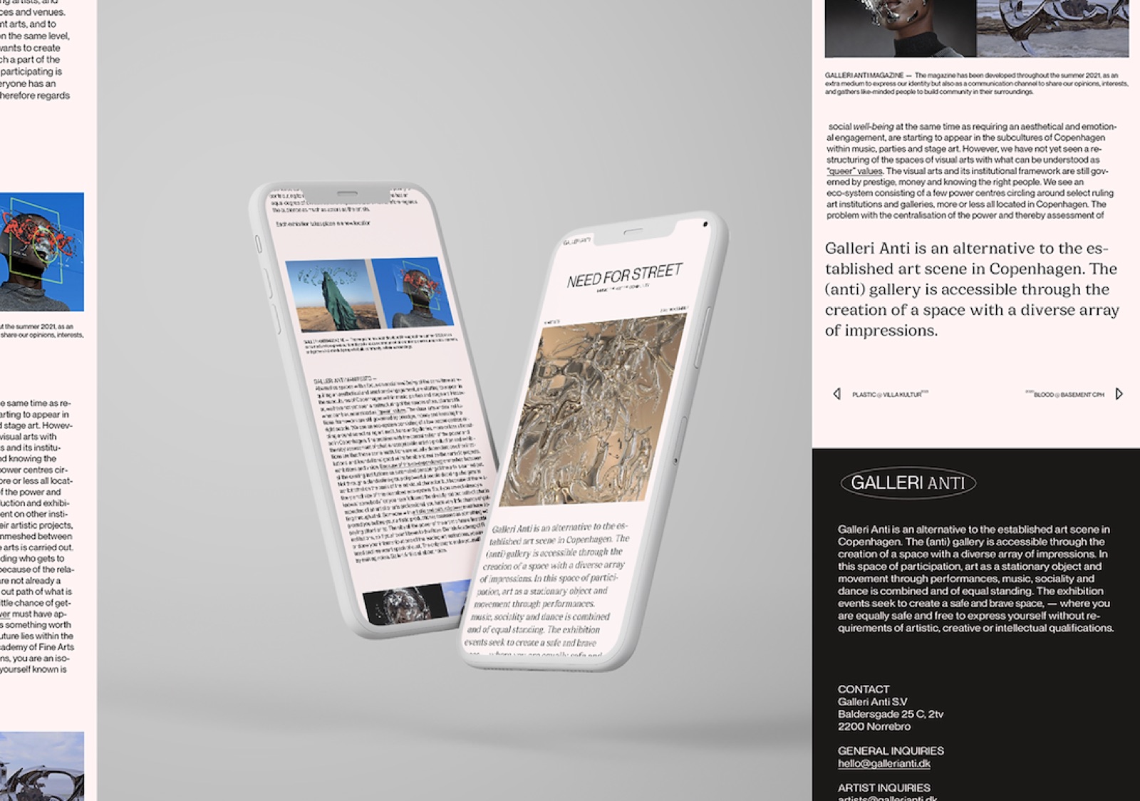
Mobile screens beside a dark contact page carrying the manifesto: Galleri Anti is an alternative to the established art scene in Copenhagen
The manifesto, carried to mobiledraft · unshipped
05 · Need for Street, the published campaign

Give me the freedom, I will explore the paths.

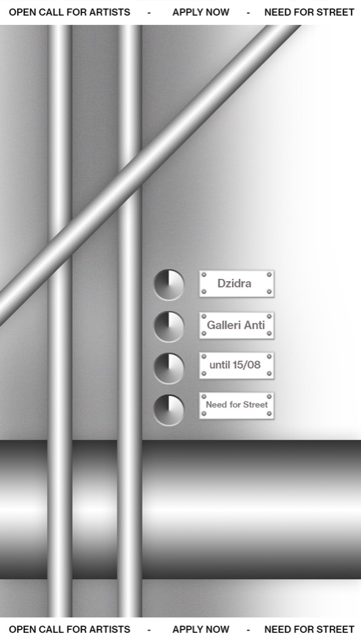
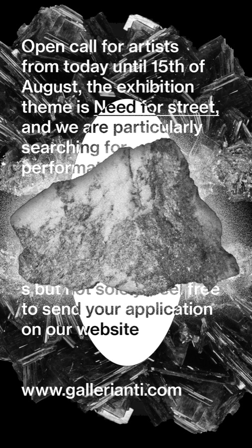
Need for Street was a real open call made with Dzidra. I kept the chrome blackletter title fixed and let each story format take on a different material: risograph red, stone, teal and chrome. The feed stayed coherent without becoming uniform.
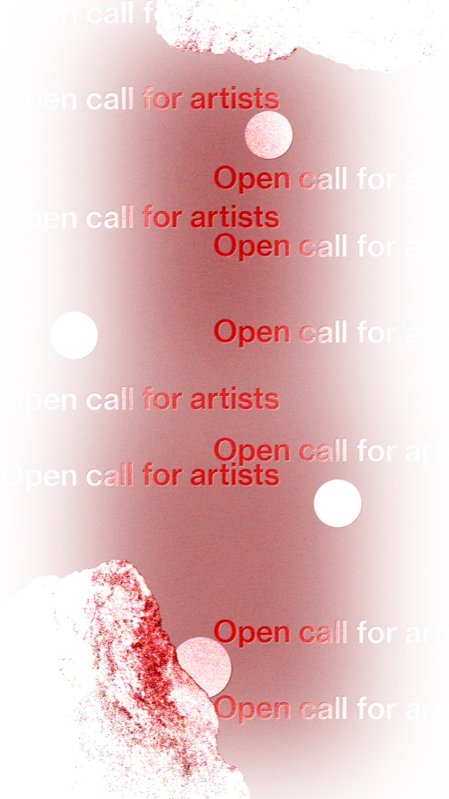
Story format in risograph red: open call for artists repeated down the frame
Riso red
Story format in black and white: open call text over cut-out stone collage, theme Need for Street, gallery website
Cut stone
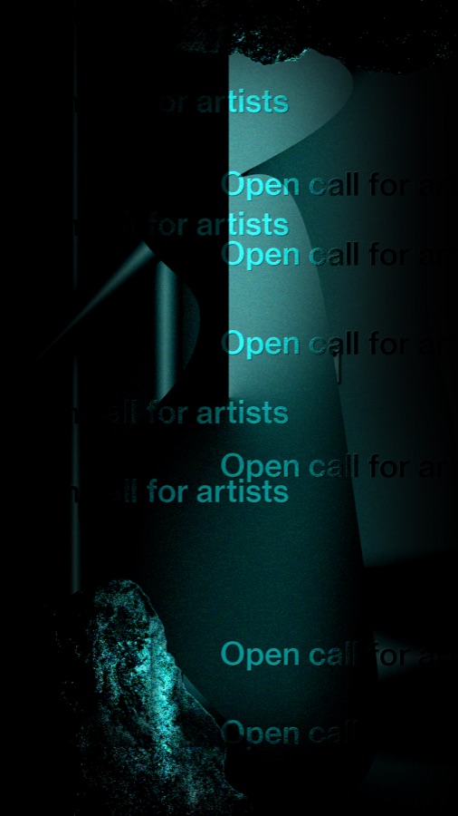
Story format in deep teal: open call for artists repeated over a dark sculptural photograph
Deep teal
Story format of rendered chrome pipes with engraved plates reading Dzidra, Galleri Anti, until 15/08, Need for Street
Chrome
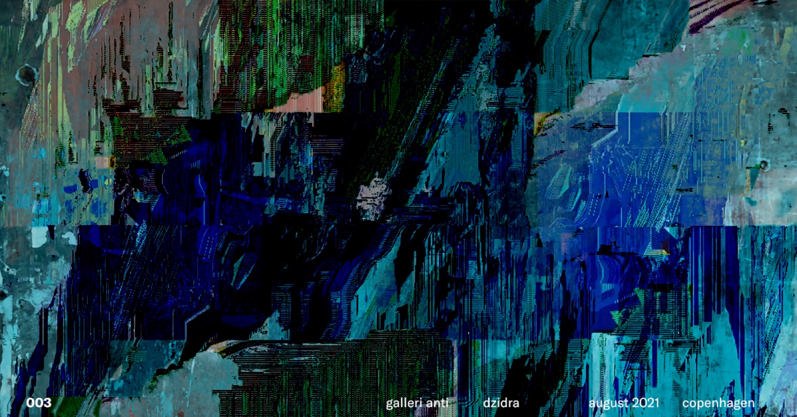
Wide abstract banner of glitched paint strokes in blues and greens, numbered 003, credited galleri anti, dzidra, august 2021, Copenhagen
The numbered series, each drop credited and dated, august 2021003 · dzidra

"I loved how much room this project gave me. I could push an idea hard, then pull it back until it still felt like the gallery."